
Portfolio
-
![]()
Homepage & Banner Ad - ABC
-
![]()
About Page - Kensington
-
![]()
Sales Letter - Books4You
-
![]()
Email - A-1 Motor Oil
-
![]()
Print Pieces - Landmark Apts
-
![]()
Facebook Ads - Landmark Apts
-
![]()
Content Pieces


ABC Toys Website Homepage & Banner Ad | SPEC
The problem: ABC Toys needed a homepage and a banner ad consisting of three slides.
The homepage for their website would briefly introduce the company to new customers, establish or increase existing customer’s trust in the brand, and ultimately get customers to purchase a product.
The banner ad was to consist of three slides that would rotate and that could each stand on their own, but also flowed nicely together when read in chronological order. The ad would end on the last slide, so that’s where they wanted the most succinct message and strongest call-to-action. The goal of the ad would be to grab the attention of their target audience and get them to visit the website and online store.
The project: Graphic designer Michele Proctor and I collaborated on this project.
We started the website off with a tagline that makes it clear what the company is about. We used dynamic images to draw people in and show off some top products, and then we delved into a slightly more detailed description of the company’s products and why they stand out from competitors. We finished off with an invite to subscribe and a featured review to lend further credibility.
For the banner ad, we created three dynamic slides that all succinctly highlight the benefit to the consumer: that these toys will help their child reach their learning potential, and they’ll have fun doing it. Each contain a clear call-to-action that take customers back to the ABC Toys’ website.


Kensington Home About Page | SPEC
The problem: Kensington Home for Dogs and Cats wanted to add an About Page to their website. They wanted this page to introduce their company and their values to new website visitors, increase existing supporter’s trust in the company, and gain more monthly donations.
The project: Graphic designer Michele Proctor and I collaborated on this project.
We started the page off with a brief explanation of what Kensington Home does, followed by a very prominent declaration: that they never put a healthy animal to sleep. This makes it easy for the reader to identify with Kensington Home’s values right away. We finished the first section up by expanding a bit more on Kensington Home’s history, reiterating their values, and going into more detail on the difference they make.
We used a second section to ask for donations. In order to avoid sounding pushy or sales-y, we somewhat-subtly explained why we need them; it’s the donations that wholly fund the organization. We finished the section by asking readers to become monthly donors, and then finished off the page with a soft secondary CTA encouraging readers to follow Kensington’s Instagram page.
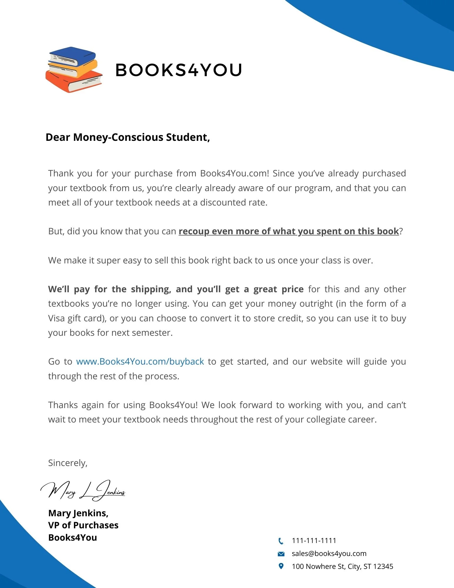
Books4You Sales Letter | SPEC
The problem: Books4You needed a sales letter that would be included with each purchased textbook. This letter would encourage their customers to both sell their textbooks back to them and to continue using them for future textbook purchases.
The project: Since the letter was included with an existing purchase, I knew that the target audience was already budget-minded, and likely excited about the money they were saving by utilizing this service. I decided to lean into that, and keep the tone friendly, informative, and somewhat casual to resonate better with the student demographic.
A-1 Motor Oil Email Ad | SPEC
The problem: A-1 Motor Oil wanted a short, promotional email to send to prospective customers. They requested that the email include a short bulleted list featuring some of the benefits of A-1 motor oil. A-1 is a luxury motor oil, so their target audience is owners of high-end, luxury cars.
The project: Since the target audience is a relatively smaller one that tends to be more heavily male, I kept the tone professional. I kept the length short and succinct in order to add to an air of exclusivity to the ad.
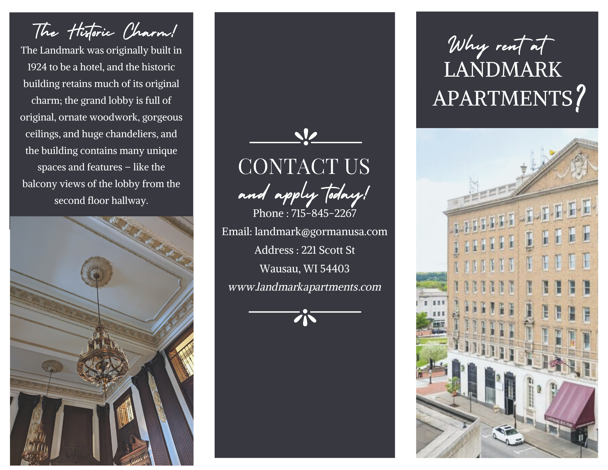
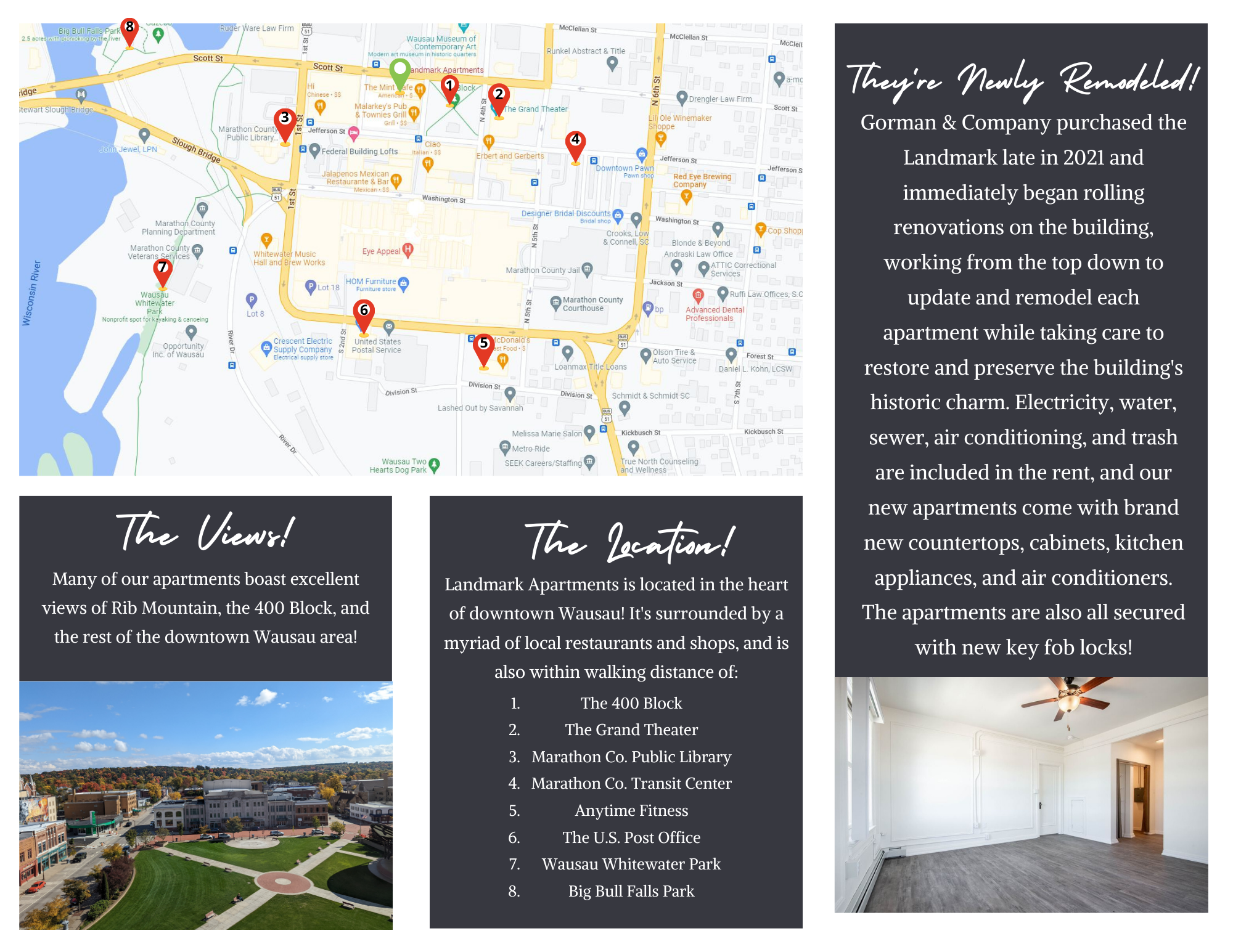
Landmark Apartments Print Pieces
The problem: Landmark Apartments recently underwent a historic remodel of the building and each of their 94 apartments. They needed to fill the remodeled apartments quickly, and had no marketing content.
The project: Landmark Apartments wanted a few print pieces to grab the attention of local prospects who might not be on social media. They wanted the pieces to convey some general background information about the building and the recent renovations and to provide contact information that prospects could use to get in touch and potentially get an application.
I created both a pull-tab flyer and a brochure, and leaned heavily into the complex’s main selling points - its awesome downtown location, its historic charm, and its status as newly-renovated.

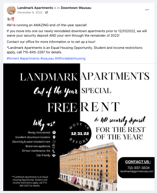
Landmark Apartments Facebook Ads
The problem: Landmark Apartments recently underwent a historic remodel of the building and all of their 94 apartments. The last two floors were finished during the worst leasing months in northern Wisconsin - November and December.
Their investors still wanted the building full by the end of the year, so they began running a special, and I was tasked with creating Facebook content to get the building leased up as quickly as possible.
The project: I created three facebook ads that we ran from November 17th through the end of the year. I wanted to make sure that the ads grabbed readers attention and that they understood the deal they’d get right away, so I made sure to feature the deal prominently in the graphic and again at the beginning of the caption. I kept the tone of each ad urgent, informational, and professional.
The results: Interest in the apartments skyrocketed, and we received many applications back. Despite income and student restrictions as well as a complicated application approval process, we reached an occupancy level of 97% by the end of the year and 100% by the end of January.


CONTENT
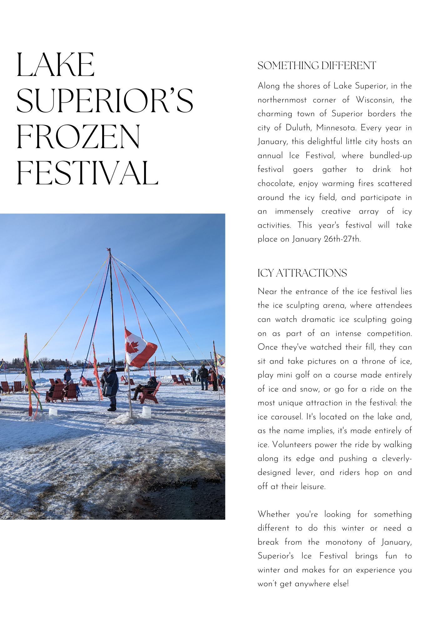
Lake Superior’s Frozen Festival | SPEC
The problem: The client wanted a short article, 200-250 words long, about an event or attraction that isn’t on most people’s radars. They asked that the article be split into an introductory section and a second part with more information.
The project: I chose to write about Superior’s Ice Festival, which I attended in January of 2023, as it was one of the most unique local events I’ve ever attended.
Since I had a short word limit to work with, I kept my introduction descriptive in order to draw readers in. I used the second section to expand upon the picture I was trying to paint and describe the various unique activities that happen simultaneously during the festival.
Home-buying Infographic
The problem: In my work as a real estate agent, I noticed that a lot of people - including many of my friends - had no idea how the home-buying process worked. My purpose in creating this (and other educational content) was twofold:
I wanted to make home-buying more accessible for everyone, and give the general public helpful information.
I worked with a lot of first-time homebuyers and wanted to provide materials for them to be able to refer back to.
The project: In order to make the process less daunting, I first broke it up into six simple steps. From there, I added details and aimed to provide just enough information to walk the reader through the process. I kept the tone as friendly as possible while staying professional and informative.
